The Perks Of Being A Wallflower.
Title:
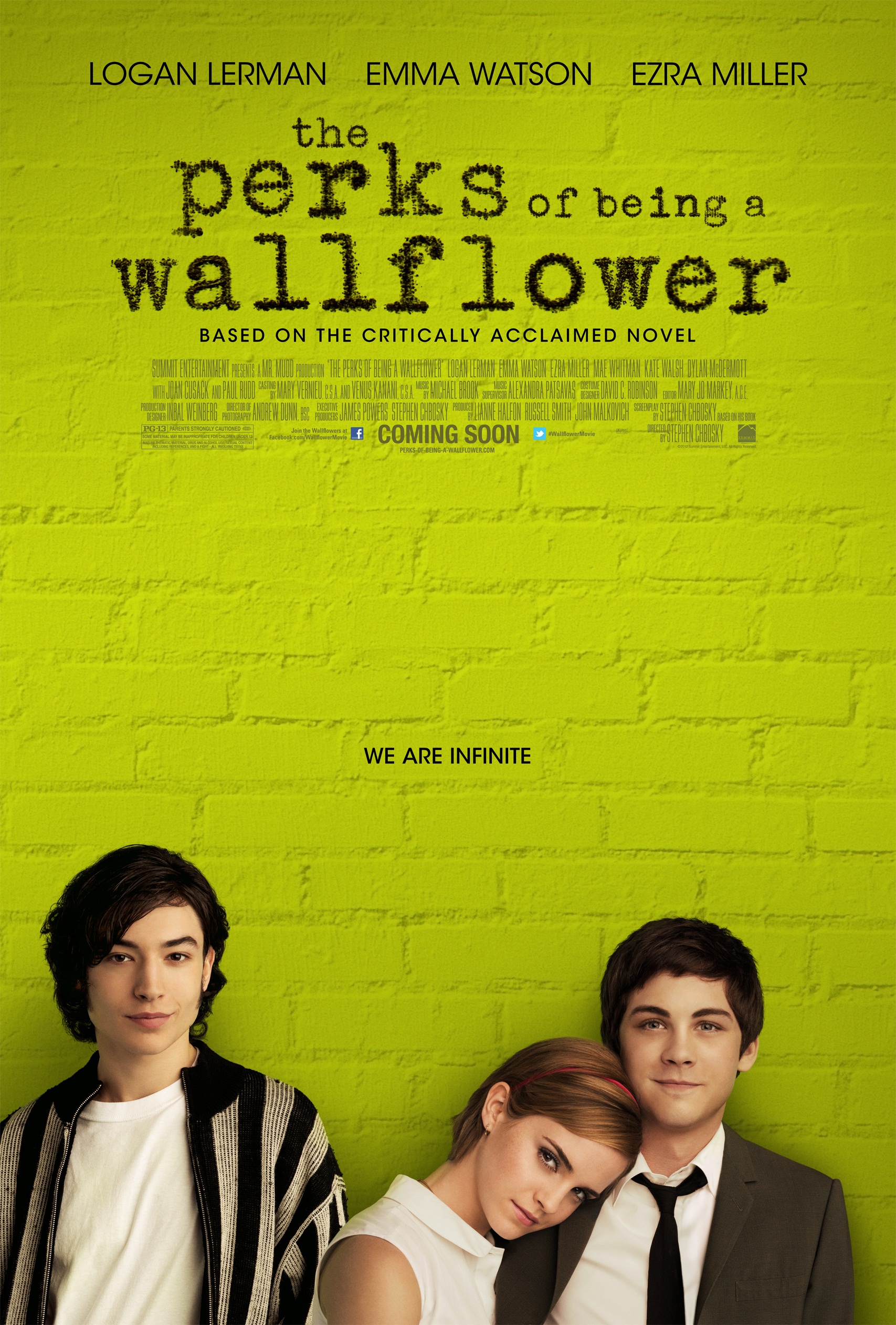
The title is a novelty font. As Charlie, the protagonist of the film uses a type writer to write his letters, the title is in a type writer font and audience's who have read the book will understand this as it has synergy because the novel is written in the epistolary form - as a series of letters to the readers. Also, the main words of the title are presented in bigger text than others, for example 'wallflower'. Being a wallflower is someone that is shy and excluded and Charlie is exactly those adjectives when he joins his new school. This attracts more costumers as they focus on the more important words of the title.

Tagline:
The tagline in this film poster is 'We Are Infinite'. The whole poster is plain with only the title, central image and the production blurb therefore, placing the slogan in the visual centre creates a big impact. Also, the readers of the book know this is a quote from the book. People that have never read the book would be curious as to what it means because although it is only 3 words, it creates a big impact. The use of the collective pronoun 'we' suggest that we are in the friendship group. This is effective to the audience because some people feel excluded and they could feel like a big part of this group.

Central Image:
The central image is of the three main character. Emma Watson, starred in many famous films like Harry Potter, Noah, Your Voice in my Head, therefore there will already be many fans of the film as they are supporting her. The same as Logan Lerman, he has starred in many famous films such as Fury, Noah and Percy Jackson and from this there will already be people supporting the film. It doesn't reveal a great deal of information about them, intriguing the audience. The fact that the girl is leaning on his shoulder connotes that they have a close friendship.

Colour Scheme:
Thee colour scheme is very simple with the theme of black and green dominating the poster. The lime green used in the background is the original colour of the book which would appeal to the audience of this film and book. Also, the fact that the background is a wall, it links to the title 'Wallflower' because it portrays the fact that the actors in the central image as wallflowers.
Actors Name:
The actors names are shown at the top of the poster as seen in many others, and it gives the names of three main actors whose characters are also seen on the poster. As well as the reason for these names being given because they are the three main characters, it may also be a source of advertisement for the film. For example, 'The Perks of Being a WallFlower' is aimed at teenagers and young adults, which the actors Emma Watson and Logan Lerman have been in films with this target audience. This will appeal to audiences because they know the genre that the actors have portrayed in and will therefore go and watch this movie because it is the same genre as most of their other movies. I think that the actors names are presented are very effective due to it being clear.

Central Image:
The central image is of the three main character. Emma Watson, starred in many famous films like Harry Potter, Noah, Your Voice in my Head, therefore there will already be many fans of the film as they are supporting her. The same as Logan Lerman, he has starred in many famous films such as Fury, Noah and Percy Jackson and from this there will already be people supporting the film. It doesn't reveal a great deal of information about them, intriguing the audience. The fact that the girl is leaning on his shoulder connotes that they have a close friendship.
Colour Scheme:
Thee colour scheme is very simple with the theme of black and green dominating the poster. The lime green used in the background is the original colour of the book which would appeal to the audience of this film and book. Also, the fact that the background is a wall, it links to the title 'Wallflower' because it portrays the fact that the actors in the central image as wallflowers.
Actors Name:
The actors names are shown at the top of the poster as seen in many others, and it gives the names of three main actors whose characters are also seen on the poster. As well as the reason for these names being given because they are the three main characters, it may also be a source of advertisement for the film. For example, 'The Perks of Being a WallFlower' is aimed at teenagers and young adults, which the actors Emma Watson and Logan Lerman have been in films with this target audience. This will appeal to audiences because they know the genre that the actors have portrayed in and will therefore go and watch this movie because it is the same genre as most of their other movies. I think that the actors names are presented are very effective due to it being clear.
In the opening scene, 0:08 is using Mise-en-scene. The reflection in the mirror shows how the character is lonely and the lightening is dark to emphasise the depression. The voice of says 'Dear Friend' at this point, making it clear that the story will be told from the characters point of view. Diegetic sound is used here.
No comments:
Post a Comment